Brand
BAM scores well in various reputation surveys. What enhances the visibility and recognition of the Group is a uniform presentation of BAM’s activities. The house style adopted by BAM offers the building blocks for a careful and consistent presentation.

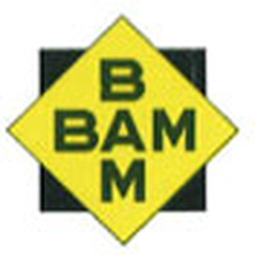
The late 1930s saw the first use of a BAM logo, namely on project information sheets. The name BAM was shown in horizontal and vertical texts within a yellow square superimposed on a black square of the same size and rotated 45 degrees.

The square-shaped BAM logo remained in use, even when in the late 1940s, the company adopted a logo showing the full company name within a cartouche (a rectangle with semi-circular ends). The company name ‘Bataafsche Aanneming Mij’ was written in black block capitals on a golden yellow background. Added to the name was ‘v/h Fa. J. van der Wal & Zoon’ (‘formerly J. van der Wal & Son’) in red gothic letters. The logo also mentioned that BAM operated offices in Amsterdam, The Hague, Arnhem and Rotterdam.
Until the early 1960s, BAM retained the cartouche logo, while including evermore locations where it had offices. When in 1961 the town of Hengelo needed to be squeezed in, the text ‘formerly J. van der Wal & Son’ was removed.

In the 1973 annual report of BAM Holding N.V., a cube-shaped logo – which laid the basis for later logos – made its first appearance. Employees referred to it as ‘the chips cutter’ (French fries cutter).
In 1992, the company refined its house style. The BAM Group logo was hot-foil printed, to create a shiny silver effect. The Group’s five divisions began using logos in their own colours: non-residential construction (yellow); residential construction (warm red); mechanical and electrical engineering (blue); building materials (dark red); and property (bright green).

In 1999, the Amsterdam design agency Total Design created a new house style for Royal BAM Group, including a new logo, new house colours (dark blue and bright yellow) and the introduction of the Argo typeface.

In early 2003, the BAM house style was adjusted after its takeover of HBG. This was done by Total Identity, which kept the logo and typeface, but changed the colours. The basis colour for the house style became green (Pantone 361), while orange (Pantone 151) was chosen as the accent colour. The green-orange colour combination had been developed for HBG by the Hague design agency Tel Design as early as 1970.
